CTRL-S
Six shapes (representing each a program of the exhibition) inspired by canadian art are at the heart of the concept. Each shape presents a straight edge at one end and a circular one at the other, therefore adding a sense of direction (reprenting a piece of a project’s process). The shortcut CTRL-S allows the 6 fragments to be reunited in the posters of the event thus representing a project in its whole. However, because of a delirious transe, the shapes have gone wild and are separated all over the exhibition. The shapes are placed so the letters UDEM (University of Montreal’s acronym) are abstractly represented.
University of Montréal
Individual Project
7 Weeks
2022
Individual Project
7 Weeks
2022


STUDY PROGRAM IDENTIFICATION

Each left page of the album contains all 6 shapes at the top left corner. However, the shape representing the program of the student on that page is highlighted with a different color (found on the page of the student’s project). This is done to represent the faculty’s disciplines as a whole and to celebrate interdisciplinarity.
TYPOGRAPHY 1

* The font was modified for the logo. Also, it is used only in black all caps in this project.
TYPOGRAPHY 2

* The dot in the middle of the zero was removed troughout the project. Also, the font was used in Black (all caps), Medium (all caps) and regular.
THE LOGO


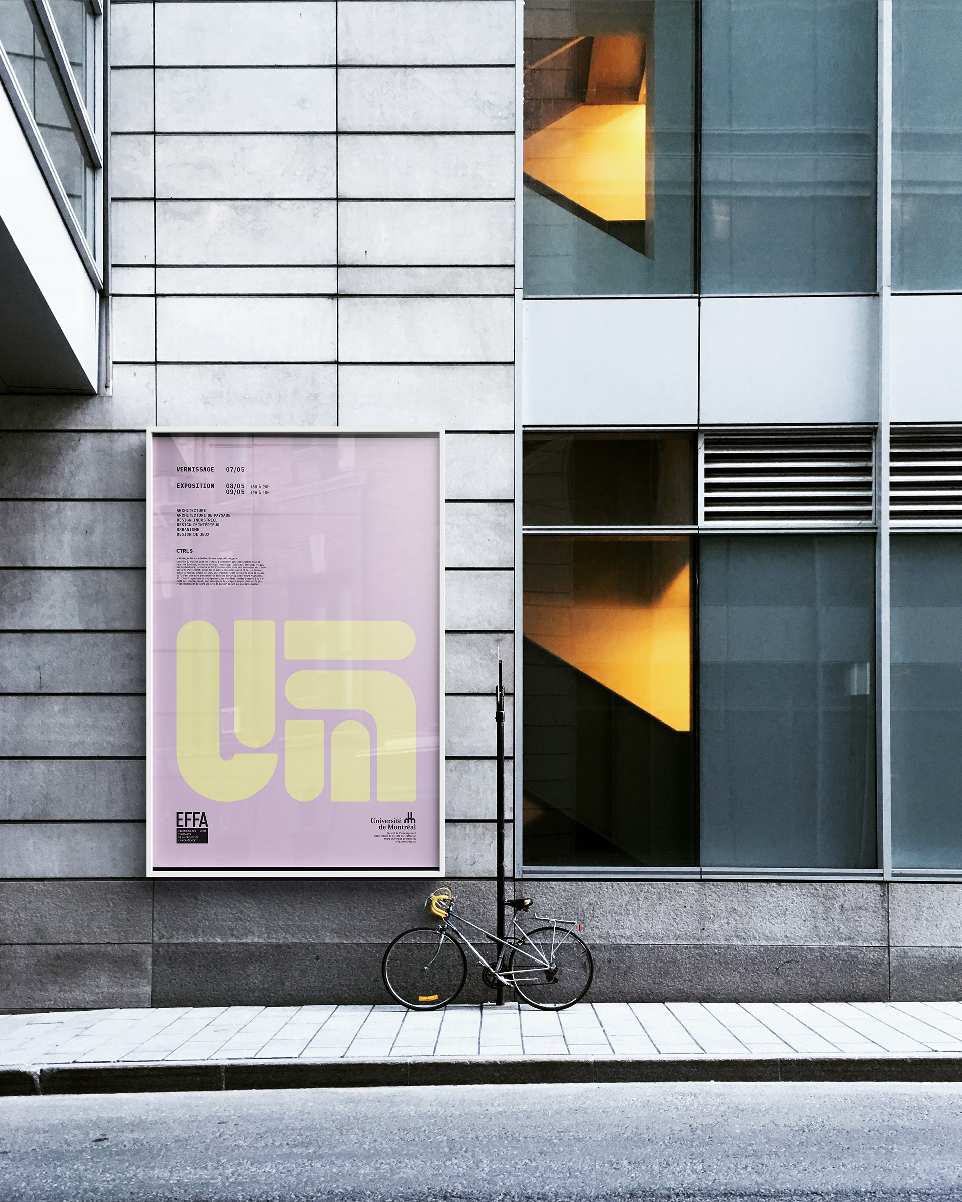
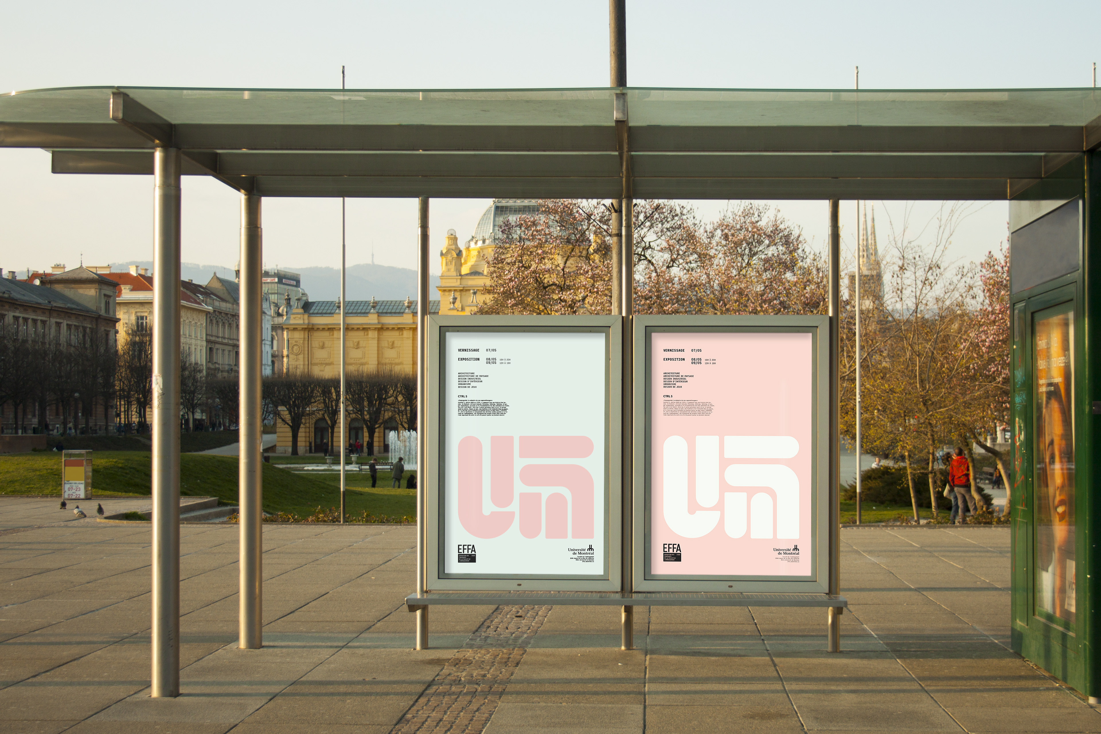
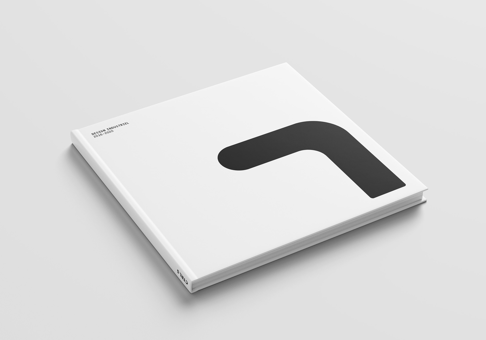
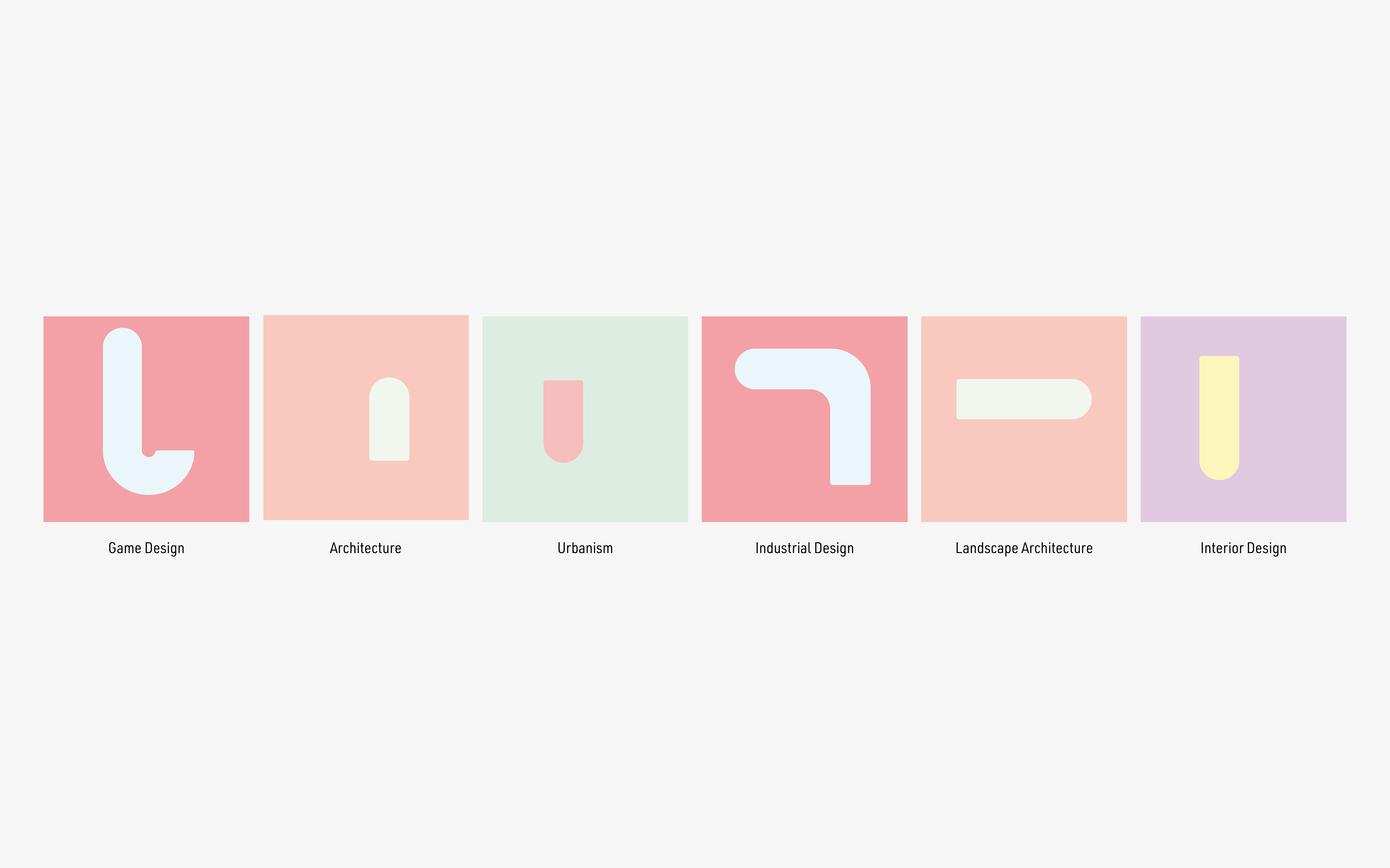
VOLOUNTEER IDENTIFICATION
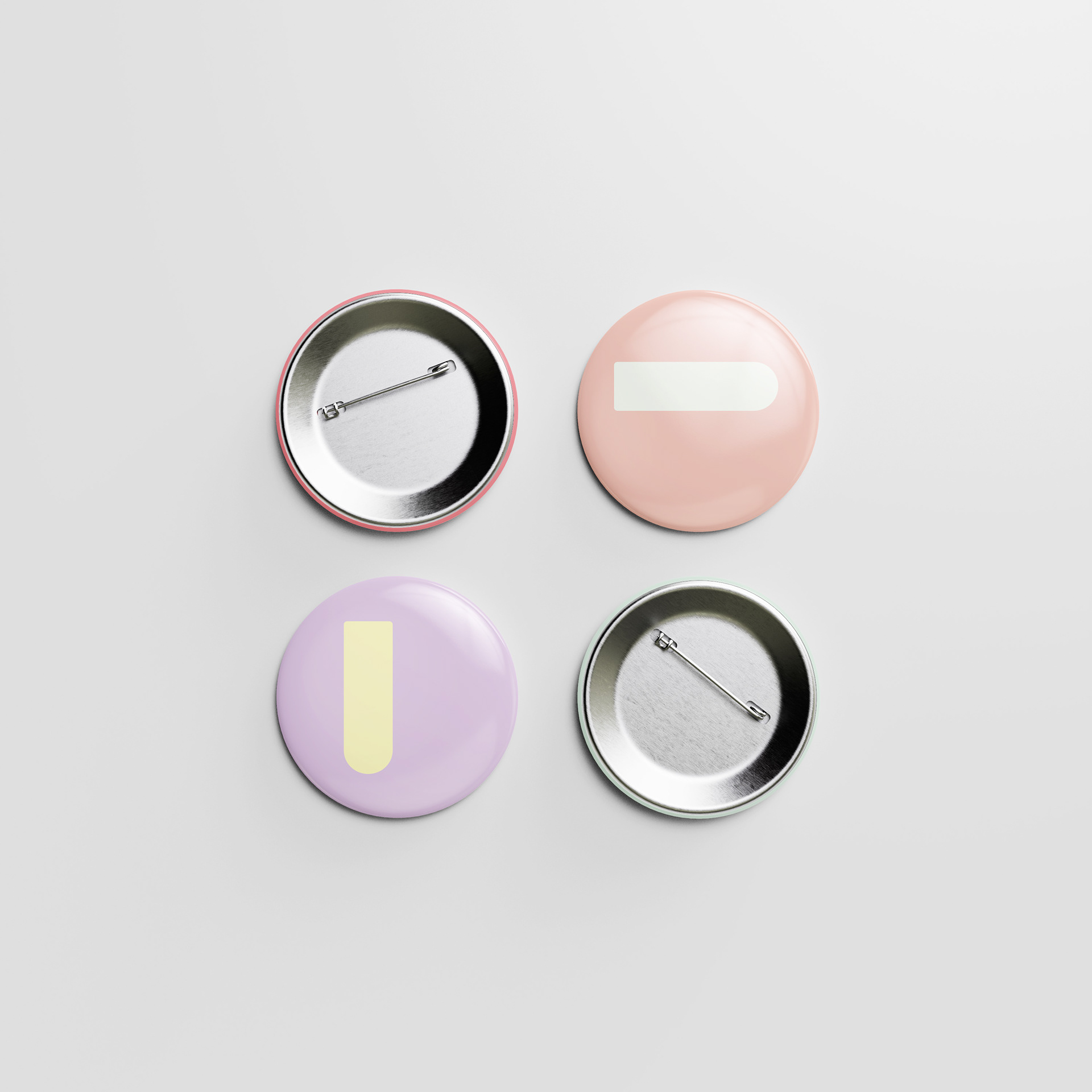
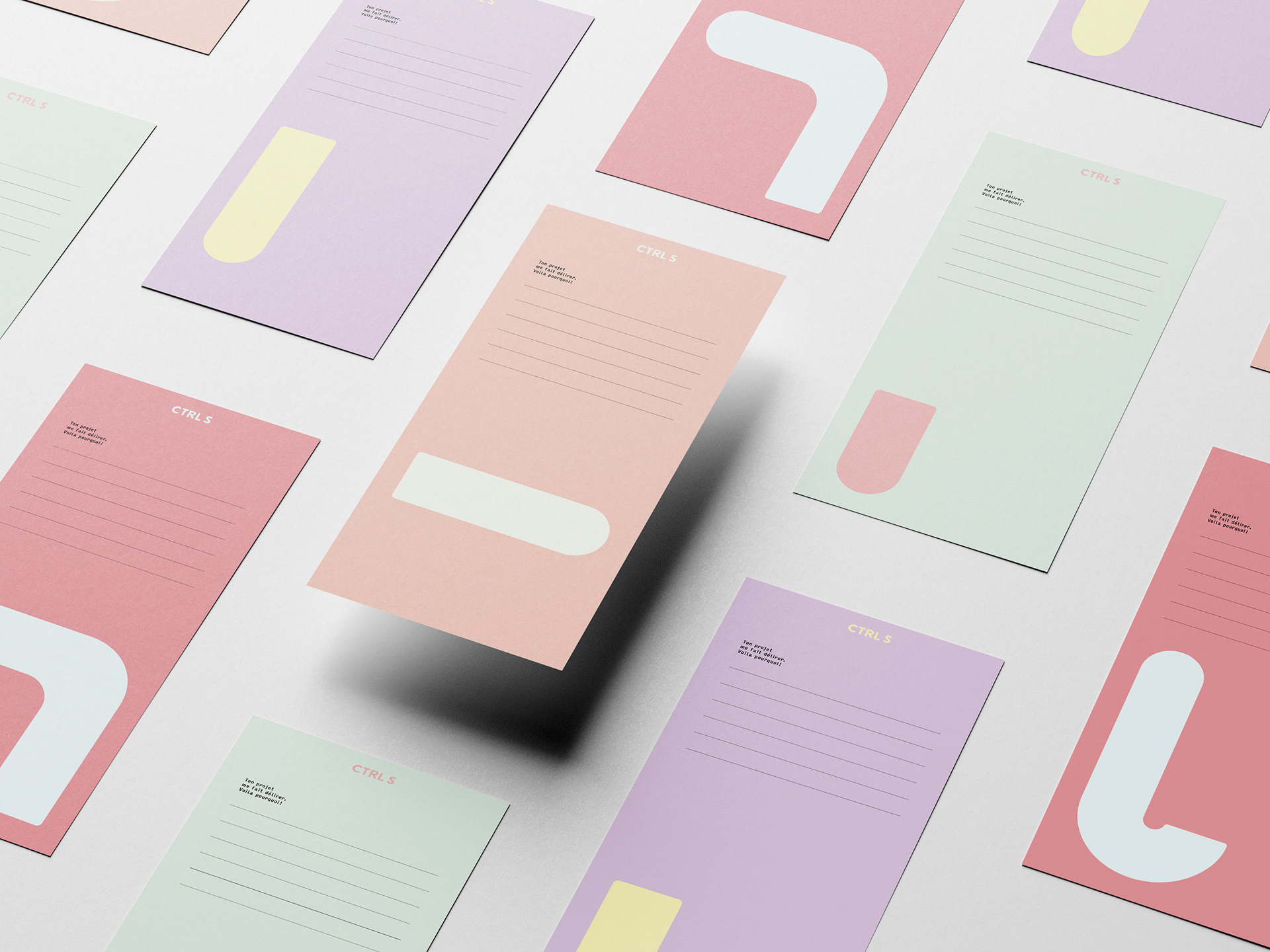
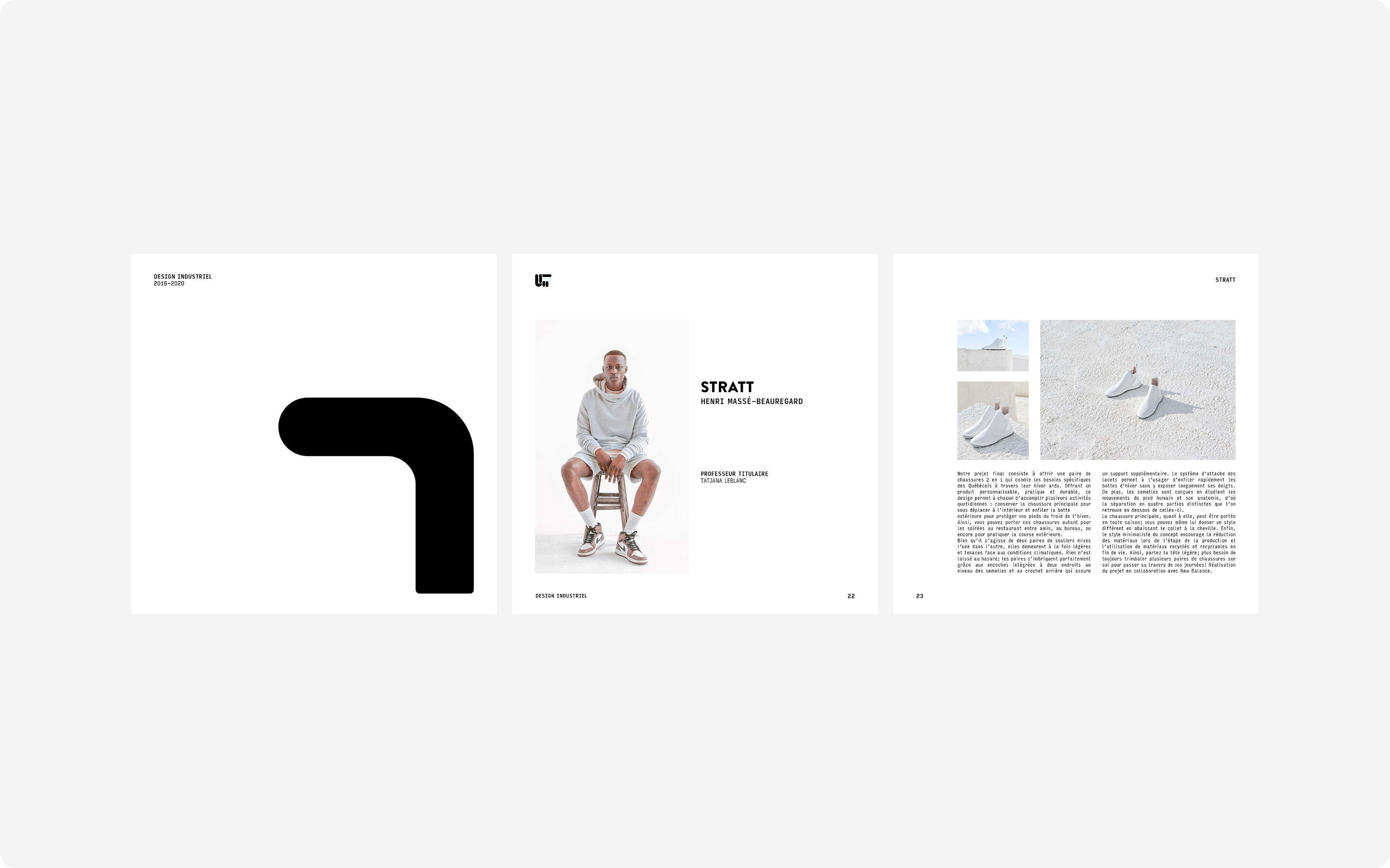
EACH BADGE PRESENTS THE COLORS ASOCIATED WITH THE 4 DIFFERENT FLOORS OF THE EXHIBITION.
That being said, volunteers will be free to choose the badge of their choice regardless of the floor to which they will be assigned, therefore reinforcing the concept of the shapes running wild all over the exhibition. The location of the shapes on the buttons corresponds to the relative location of these on the poster illustration, thus creating a visual harmony between the poster and the identification of the volunteers


MERCHANDISE OPPORTUNITY

